A system experiment
Daycare App Design
A mobile app concept designed to help parents and daycare staff stay informed, organized, and connected.
Personal
Typography
Branding
Why I built this
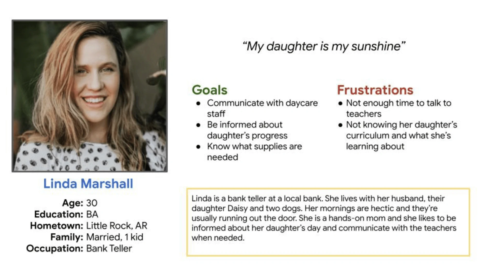
This project started during the Google UX Design Certificate while I was a first-time parent navigating daycare life myself. At the time, my son's daycare didn't use an app or any consistent way to share updates throughout the day. Drop-off and pick-up conversations were brief, and as a new parent, I spent a lot of time wondering how his day was going and if he had eaten anything besides crackers.
What made it more interesting is that I didn't even know daycare apps existed. The project became an opportunity to explore how better communication, clearer information, and thoughtful UX decisions could make busy parent moments feel a little less chaotic.
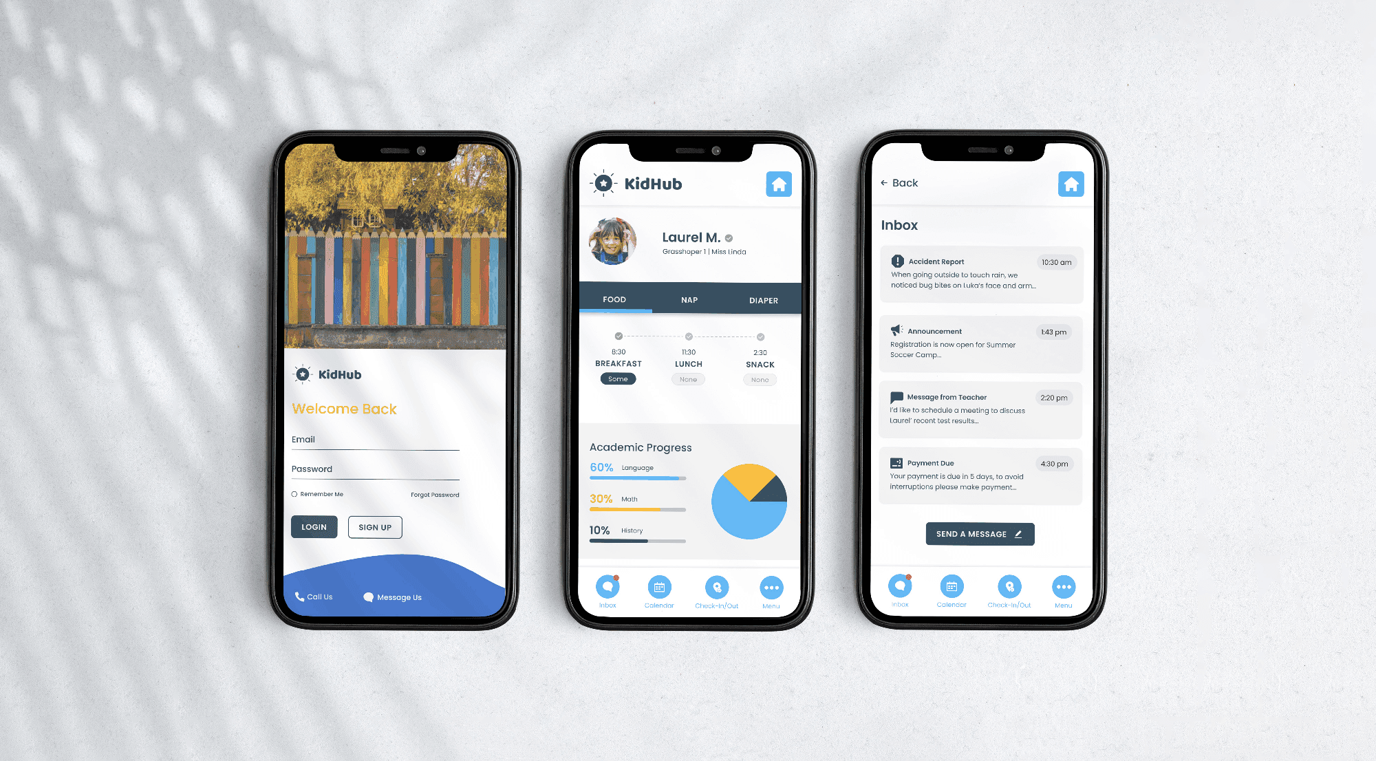
The experience focused on improving communication between parents and daycare staff through accessible information, simplified updates, and a more connected daily experience.
Research shaped the direction.
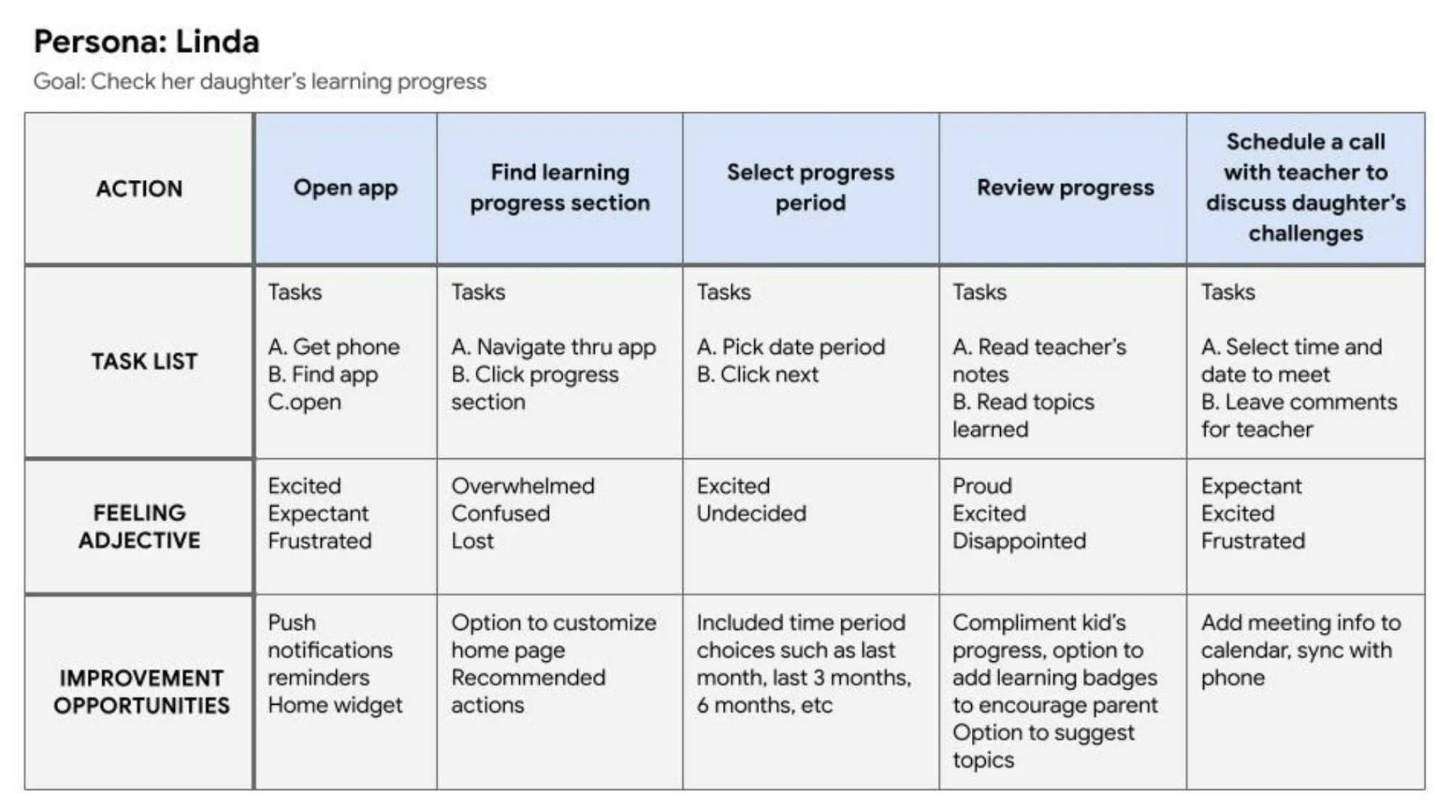
Early interviews and usability findings pointed to a few consistent pain points.
Parents needed information surfaced faster
Important updates were difficult to find
Drop-off and pick-up moments left little time for communication
Existing workflows created unnecessary friction
Research findings directly influenced navigation decisions, content prioritization, and accessibility improvements, helping shape a simpler experience focused on speed and clarity.
Research shaped the direction.
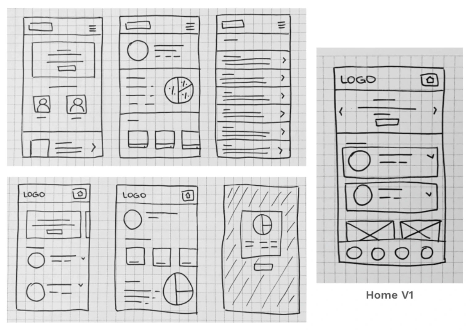
Paper wireframes and early concepts focused on testing navigation patterns, content hierarchy, and information visibility before moving into higher-fidelity design work.
The goal was not visual polish first. It was building structure that supported clarity.
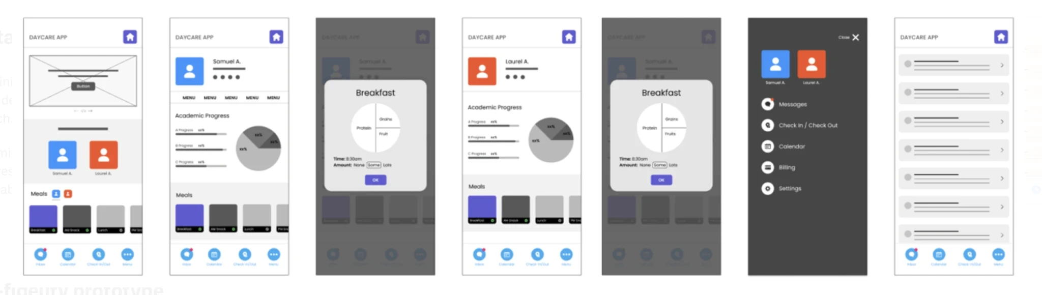
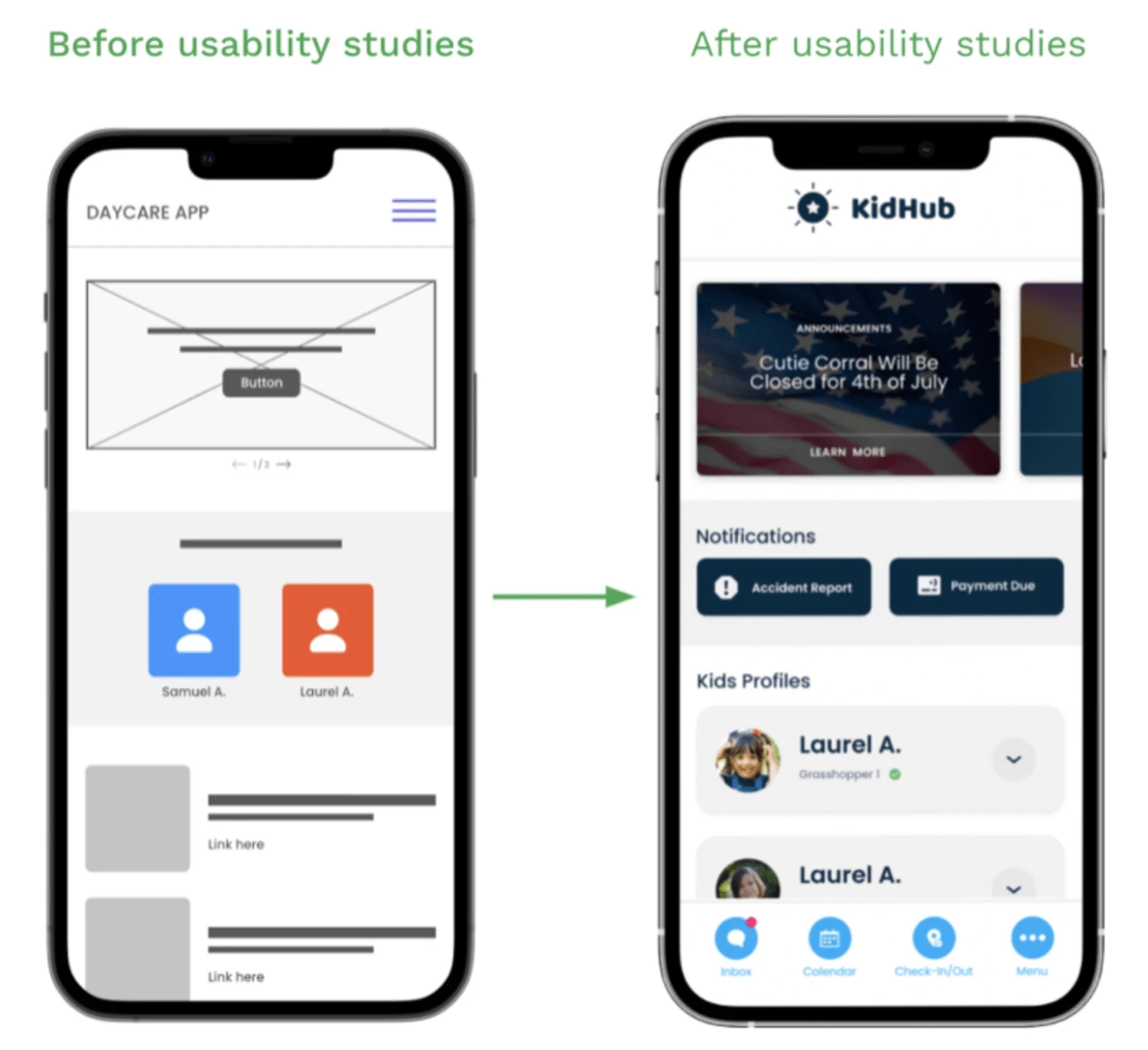
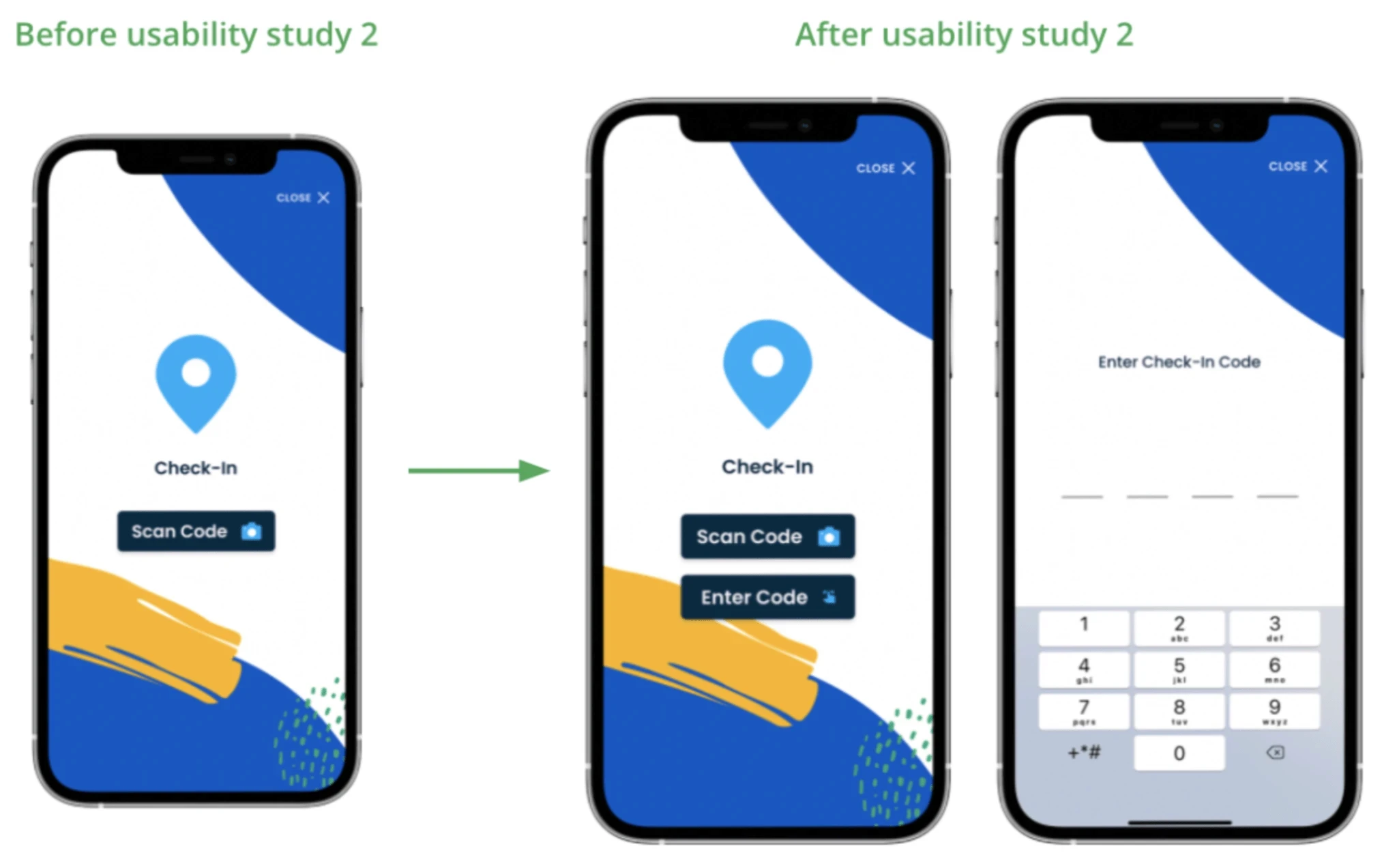
Iteration improved usability.
Testing revealed opportunities to simplify interactions and improve accessibility. Changes included:
Prioritizing important information on the home screen
Increasing accessibility and information clarity
Improving navigation visibility
Refining layouts based on usability feedback
Adding manual check-in alongside QR scanning
Small adjustments helped reduce friction while making the experience easier to understand and use.