Daycare App Design
A mobile app concept to help parents and daycares stay informed, organized, and connected.
Role
UX/UI Designer
Industry
Childcare
Duration
6 months
Overview
In fast paced urban areas, working parents often struggle to manage schedules, co parent effectively, and stay informed about their child’s daily activities. At the same time, daycares face challenges providing timely updates to families, especially during busy check in and check out periods. This app was designed to improve communication between parents and daycare staff by giving families quick, easy access to essential information about their child’s development.
The Challenge
Enable smooth, efficient communication between busy parents and daycare teachers despite time constraints, limited staff availability, and chaotic drop off and pick up times.
The Objective
Design a user-friendly mobile app that:
Streamlines communication between daycares and parents
Provides quick access to daily reports, updates, and messages
Reduces in-person congestion and improves check-in/out experiences
My Responsibilities
Conducted user interviews with parents and daycare staff
Created low- and high-fidelity wireframes (paper & digital)
Built and tested interactive prototypes
Incorporated accessibility best practices (color, hierarchy, contrast)
Led two rounds of usability testing and refined designs based on feedback
User Research Summary
Key Insights:
Parents want fast, clear access to updates, especially on the home screen
Limited time and availability make face-to-face communication difficult
Drop-off and pick-up times are often rushed and overcrowded
Challenges Identified:
Time Constraints: Working parents need information at a glance
Limited Staff Access: Teachers can’t always respond in real time
Inefficient Check-In: Long lines and limited tech options frustrate parents
Problem Statement
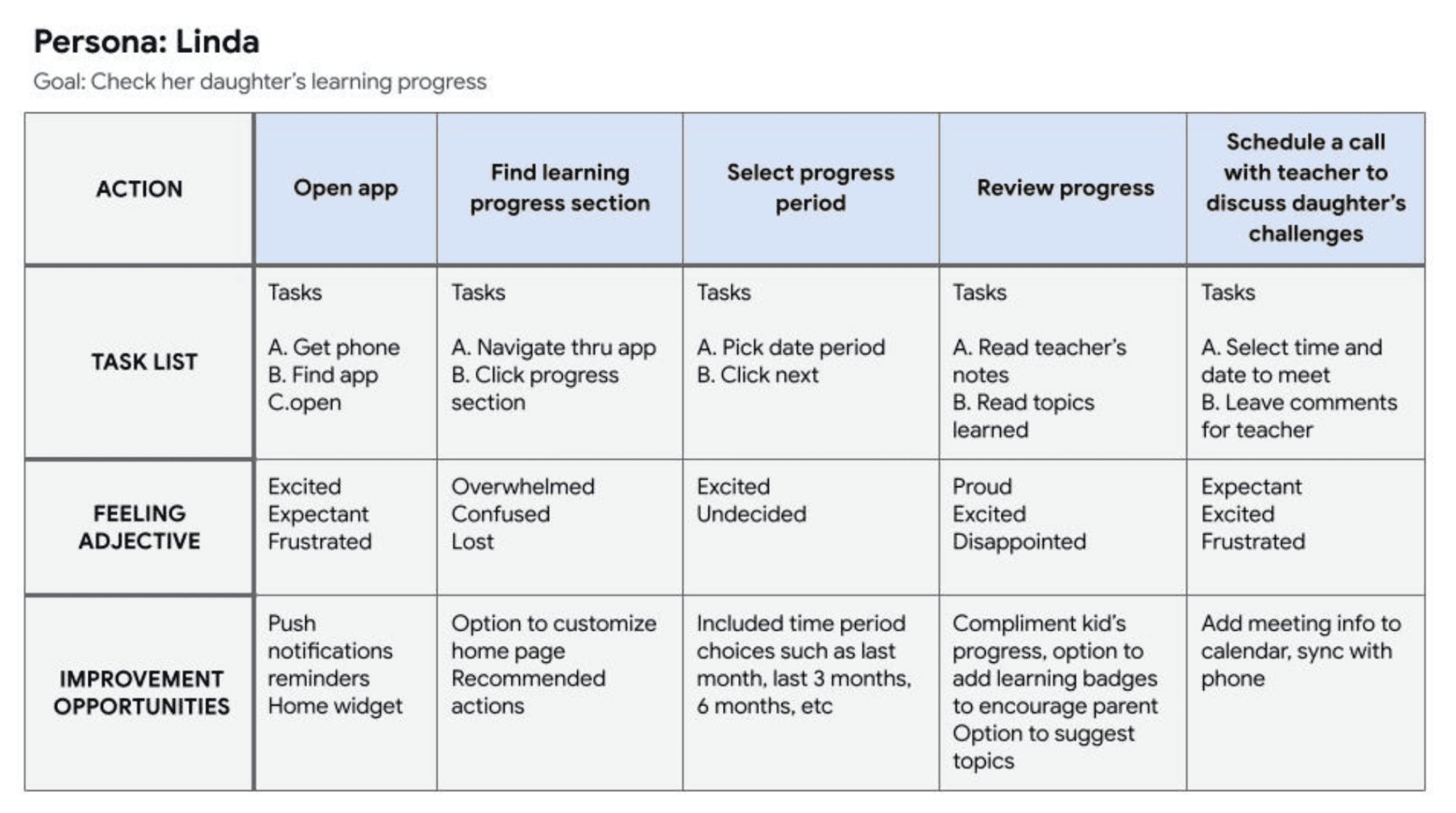
Linda, a full-time working mother, needs a convenient way to stay informed about her daughter's development and daycare experience without relying on in-person conversations or paper handouts.


Design Process
Wireframes
Paper Wireframes:
Sketching multiple layout variations helped identify the most intuitive solutions early, focusing on solving pain points around navigation and information visibility.

Digital Wireframes:
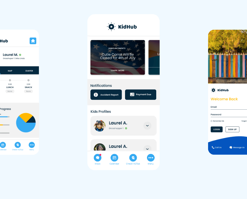
Initial screens were informed by research findings, prioritizing the home screen layout and accessibility of the child’s daily report section. Early feedback shaped the inclusion of a dedicated “Kid Profile” for quick access to academic and behavior updates.

Usability Testing & Iteration
Round 1 Findings:
Users want the most important info front and center (on the home screen)
Many struggled to recognize the hamburger menu
The messages section was difficult to locate
Round 2 Improvements:
Users requested urgent messages on the home screen
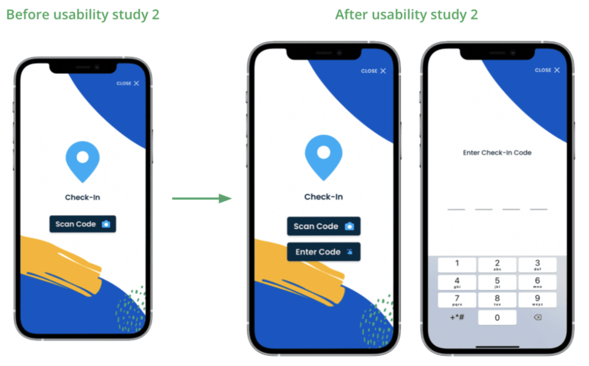
Some users needed a manual check-in option in addition to QR scanning

Refining the Design
Mockups & Visual Enhancements:
Based on testing, the app layout was updated to include a bottom navigation bar for easier access to key features. The “Kid Profile” section was redesigned using a toggle-card layout, allowing parents to view daily progress at a glance.
Accessibility Addition:
To address concerns around the camera based check in, a manual input option was added. Parents can now enter a code received at enrollment, improving accessibility for users without reliable camera access or those with disabilities.
Other projects
Typhlora™
A typographic design system built from a single construction rule and a proof of concept for how I think about design.
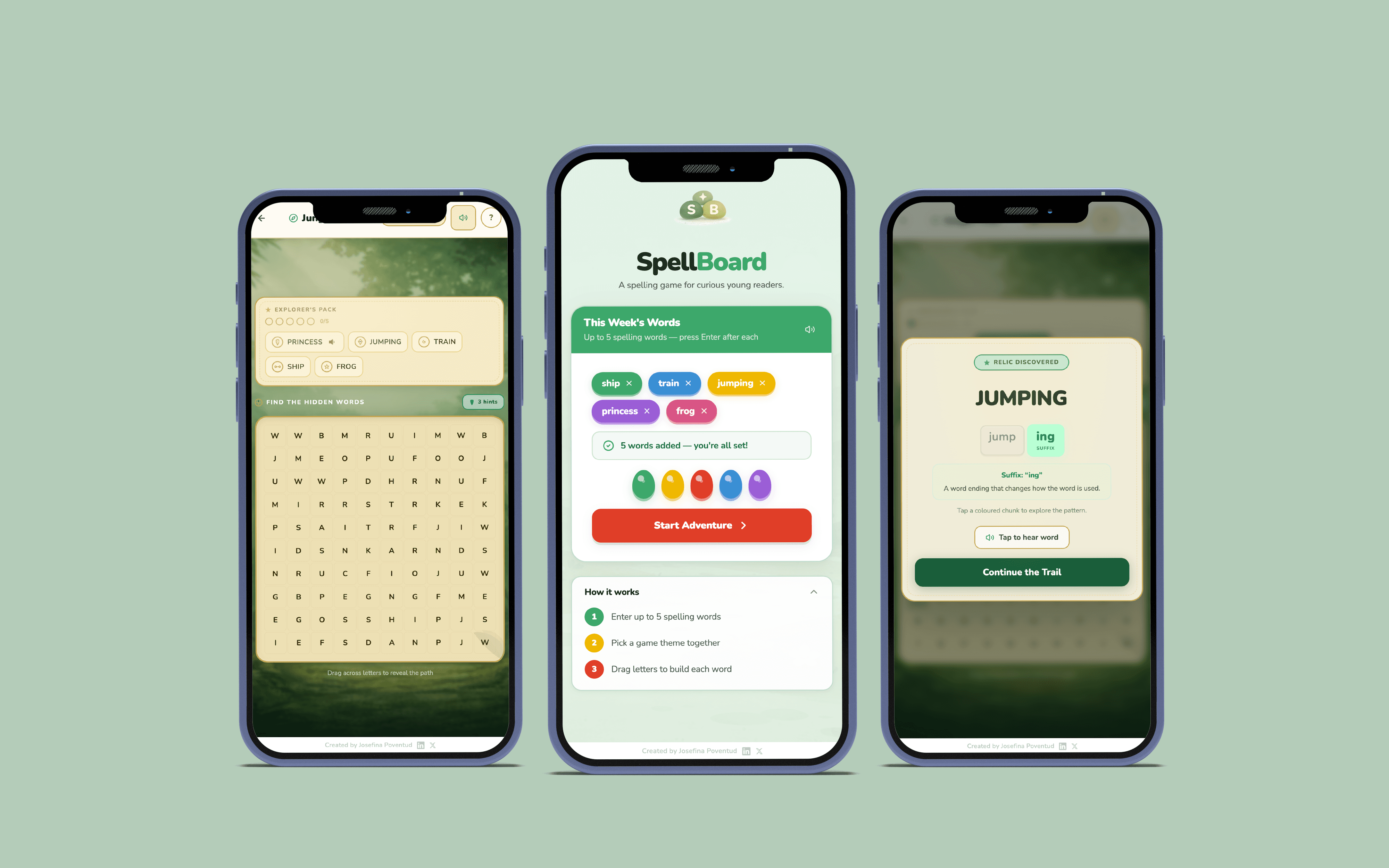
SpellBoard
A UI/UX concept for a mobile learning tool. Designed around fast visual scanning, accessible hierarchy, and clear information flow.

ABPC: Giving Back – The Soul of Philanthropy
Exhibit visual design and campaign collateral for a cultural philanthropy event. Full system spanning print, digital, and merchandise. GD USA American Graphic Design Award, 2024.

Bank OZK Referral Training Game
Visual design for a scenario-based print training tool. Card system, packaging, and collateral built for clarity and in-game decision making.

ABPC Listening Sessions Report Design
Strategic report design for ABPC listening sessions