Typhlora™
A typographic design system built from a single construction rule and a proof of concept for how I think about design.
Role
Creator, Designer, Art Director
Industry
Design Systems, Typographic Systems, Personal Practice
Duration
March 2026, ongoing
Where It Started
I needed to build a brand for myself. That meant starting from scratch on something I could genuinely call mine and figuring out not just what it would look like, but what it would stand for.
The first question was the motif. I wanted something that could tile, repeat, and scale the way Marimekko does it: bold and systematic. I started with flowers, something botanical. But the more I explored it, the more it felt borrowed rather than built.
So I asked a different question: what if the flower was made entirely out of type? Not letters printed on a petal but the letterform itself becoming the petal through rotation and repetition. I took a single character, arranged it radially, and watched it stop reading as a letter and start reading as something else. A rosette. A seal. A bloom. The form emerged from the structure. That felt like mine.
The Construction Rule
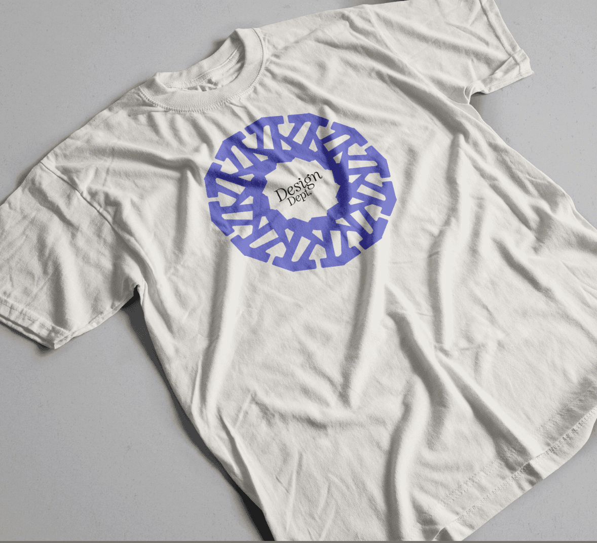
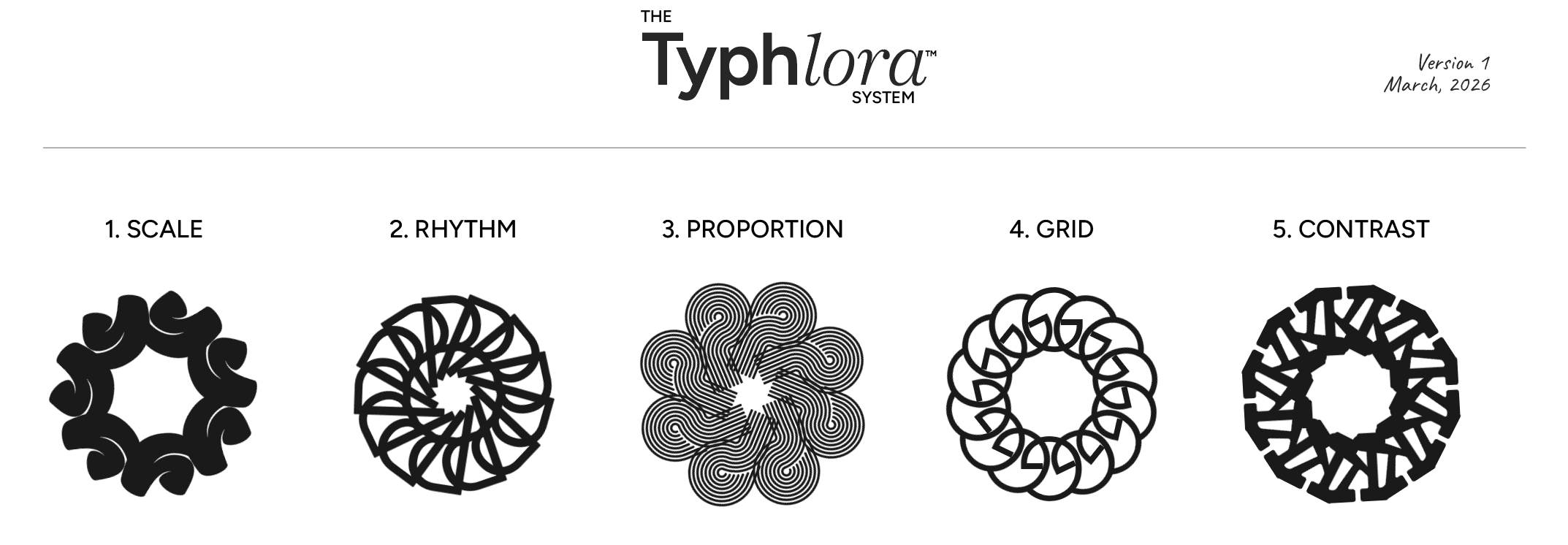
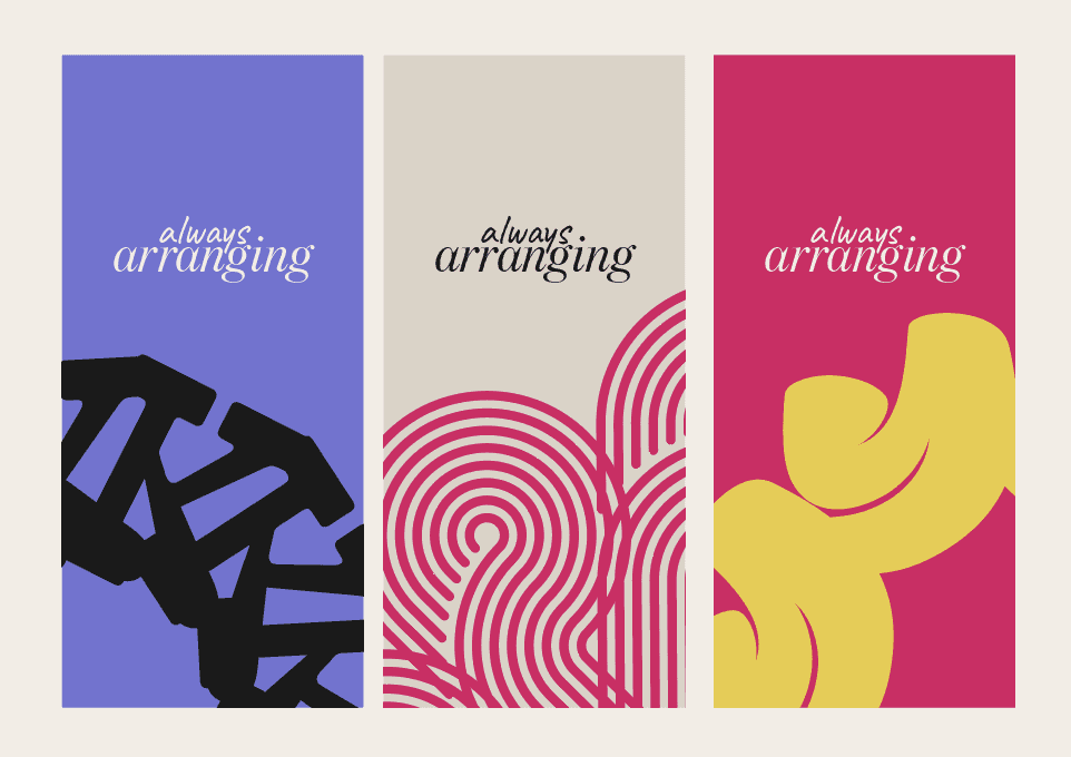
Typhlora is built on one rule: one letterform, repeated radially, until it becomes something new. Every mark in the system follows it. What changes is the letter, the count, the angle, and the spacing. Those variables give each Bloom its distinct character while keeping them unmistakably related.
From there, the system built itself around what I actually believe about design. I work from principles first. Grid, proportion, contrast, rhythm, scale. These are not decorative concepts to me. They are what makes a piece of communication work. So I mapped each Bloom to one of them. Every mark now has a reason to exist beyond how it looks.
How the System Holds Together
Typhlora holds together because it has one rule and it never breaks it. One letterform, repeated radially, until it becomes something new. Every Bloom was made the same way. What changes between them is the letter chosen, the number of repetitions, the angle of rotation, and the spacing between units.
Every Bloom is built on a 350 by 350 pixel artboard and contained within a consistent bounding circle. Scale to the bounding circle in every application, not the artboard edge. That single constraint keeps the marks proportionally consistent across any size or surface.
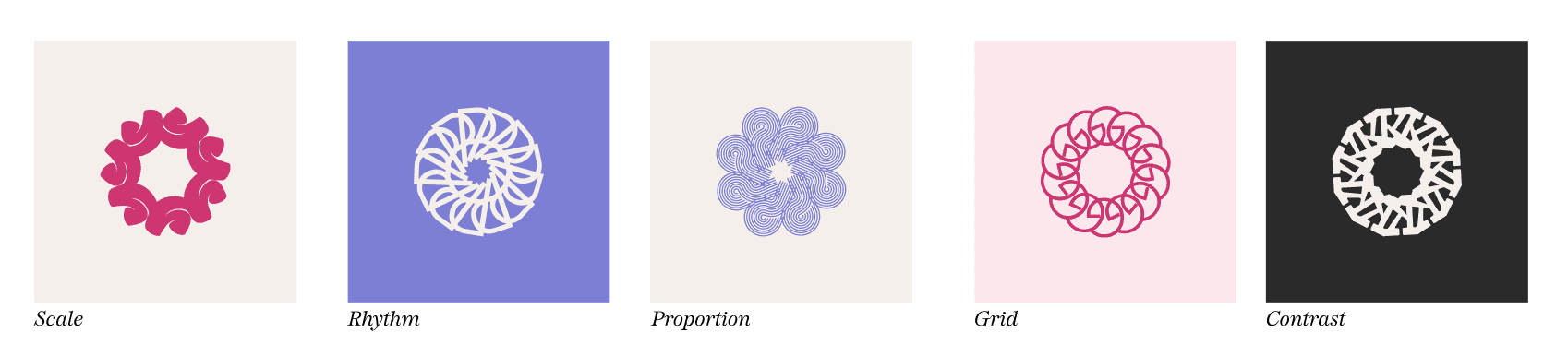
The second layer of structure is the principle mapping. Each Bloom is assigned to one design principle and one only. Scale. Rhythm. Proportion. Grid. Contrast. The mapping is not decorative. It is the reason each Bloom exists. A new Bloom is not added for variety. It is added when a principle earns representation.
Each Bloom also carries its own color pairing, assigned at the system level:
Scale: Fuchsia on Cream
Rhythm: Warm White on Periwinkle
Proportion: Periwinkle on Warm White
Grid: Fuchsia on Blush
Contrast: Warm White on Ink
The pairings are intentional and fixed. They are part of the spec, not suggestions.
Why It Matters Beyond the Visuals
Every time I put Typhlora through an image generator, it came back wrong. Not because the tools were bad but because the concept lives in the logic, not the output. The judgment, the taxonomy, the principle mapping, the decision to skip a number in the system because of how it felt: none of that transfers to a prompt.
That is what makes it useful as a proof of concept. It demonstrates how I think, not just what I can make. Anyone can produce assets. Not everyone can build the framework that makes those assets coherent across time, formats, and hands. Typhlora is evidence of the latter.
What the tools produced when I described the concept
What the tools produced when I described the concept. Letters arranged in a circle. A radial form with annotation marks. Type repeated on a grid with proportion labels. Every output interpreted the prompt literally and got the surface right while missing the point entirely. None of them were Typhlora. The system lives in the decisions underneath: which letter, which count, which principle it maps to, and why none of those choices are interchangeable. That part does not transfer to a prompt.


Status
Typhlora is intentionally unfinished. It grows as the practice grows. New principles earn new Blooms. That open-endedness is not a weakness. It is the most honest thing about it.
Version 1 in progress. First documented March 2026.
Other projects
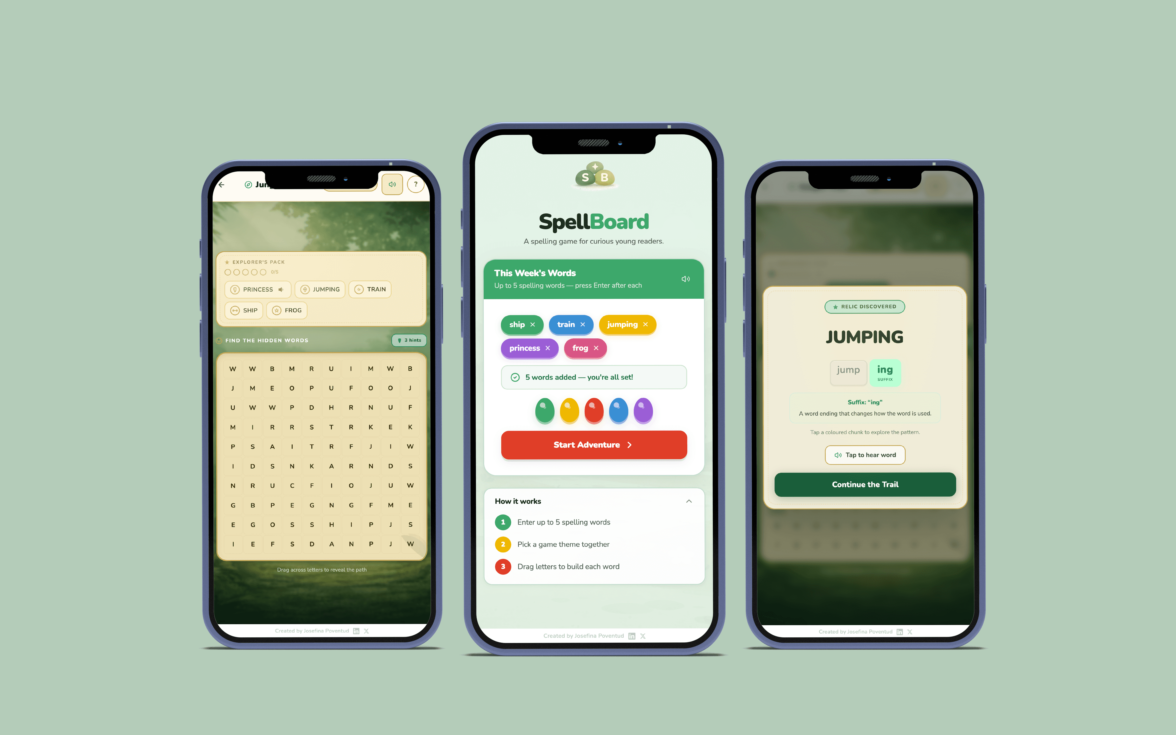
SpellBoard
A UI/UX concept for a mobile learning tool. Designed around fast visual scanning, accessible hierarchy, and clear information flow.
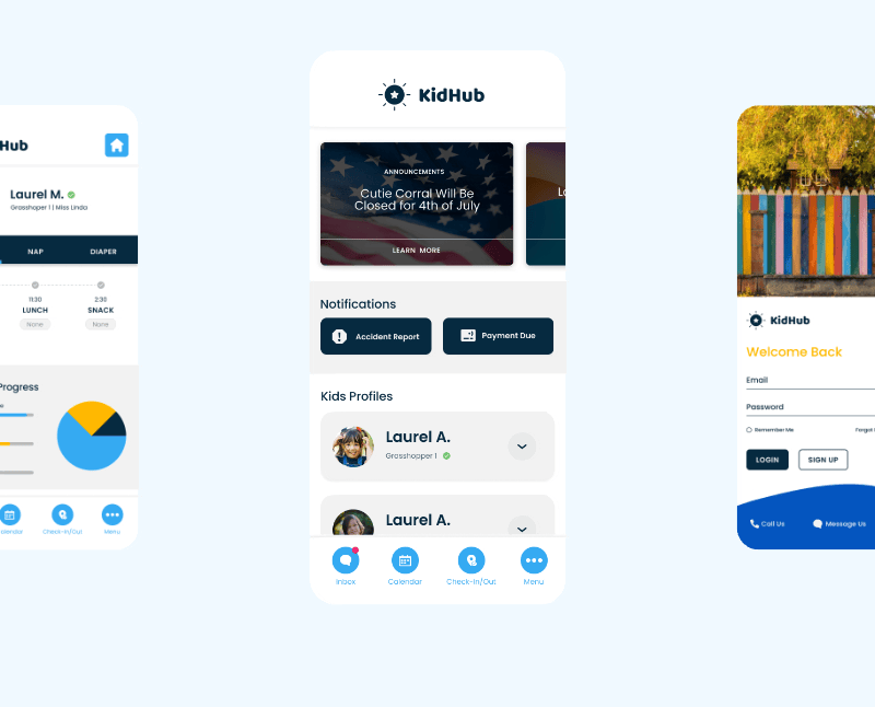
Daycare App Design
A mobile app concept to help parents and daycares stay informed, organized, and connected.

ABPC: Giving Back – The Soul of Philanthropy
Exhibit visual design and campaign collateral for a cultural philanthropy event. Full system spanning print, digital, and merchandise. GD USA American Graphic Design Award, 2024.

Bank OZK Referral Training Game
Visual design for a scenario-based print training tool. Card system, packaging, and collateral built for clarity and in-game decision making.

ABPC Listening Sessions Report Design
Strategic report design for ABPC listening sessions